hi, i'm brody
I am a
I'm a Web Developer and Graphic Designer based in Calgary, Canada. I specialize in designing user-friendly and visually appealing websites and designs that align with project goals while captivating users with aesthetic appeal. By combining my knowledge in visual design principles and UX concepts, and programming knowledge, I craft professional designs that aim to inspire and leave a lasting impact.
I recently graduated from the Interactive Design program at the Southern Alberta Institute of Technology with a major in Web Development, where I developed my skills in an industry-focused environment. The program emphasized core learning in web development, graphic design, and user experience. During my time there, I also built strong problem-solving and time management skills. I often took on leadership roles, serving as both project manager and design lead. These experiences strengthened my collaboration and communication abilities and prepared me to confidently step into the industry.
my skills:

Web Development
HTML, CSS, JavaScript, PHP, SQL, Responsive Design, Accessibility, UI/UX principles.

Graphic Design
Brand Design, Style Guides, Logo Design, Poster Design, Digital Marketing strategies.

Creative Endeavors
Freelance projects, Brand Creation, and innovative design solutions.
my projects:

Core Athletics is a project I created after conducting research and noticing a gap in the market—there was no streamlined platform that combined meal and calorie logging, workout tracking, and direct access to coaching services. Because of this, clients and coaches often faced unnecessary friction when managing schedules, tracking progress, and staying engaged. This hindered overall satisfaction and discouraged people from pursuing or achieving their nutrition and fitness goals.
The solution was to build an all-in-one dashboard website that brings all these services together, centered around a main dashboard that provides a daily breakdown of these three core areas. Think of it as a mix of MyFitnessPal, FitNotes, and Calendly.
By integrating these features, coaches can better prepare for sessions, monitor their clients’ progress, and create more effective plans to address any fitness-related questions or needs athletes may have.
Design
Design elements for this project included creating both the primary and secondary logos, and applying brand guideline elements consistently across the website to maintain a strong and cohesive brand presence.
Development
This project was developed using a modern, full-stack approach that ensured both responsiveness and dynamic interactivity. The tech stack includes:
- HTML – Structured the content and layout of each page for semantic clarity.
- CSS (Bootstrap) – Created responsive, mobile-friendly designs with consistent spacing and styling.
- JavaScript + Chart.js – Added interactive components like real-time charts and user feedback elements.
- PHP – Handled server-side logic such as form processing, authentication, and booking interactions.
- SQL – Managed structured data storage with relational tables for users, bookings, and logs.
Building this brand brought together several areas I'm passionate about in my personal life. Feeling physically healthy has a significant impact not just on your body, but on your mental well-being too. The goal of this project was to reduce the stress people often feel when introduced to challenging concepts like fitness and nutrition. I plan to continue improving this project in the future, as this is the kind of work I’m truly passionate about.

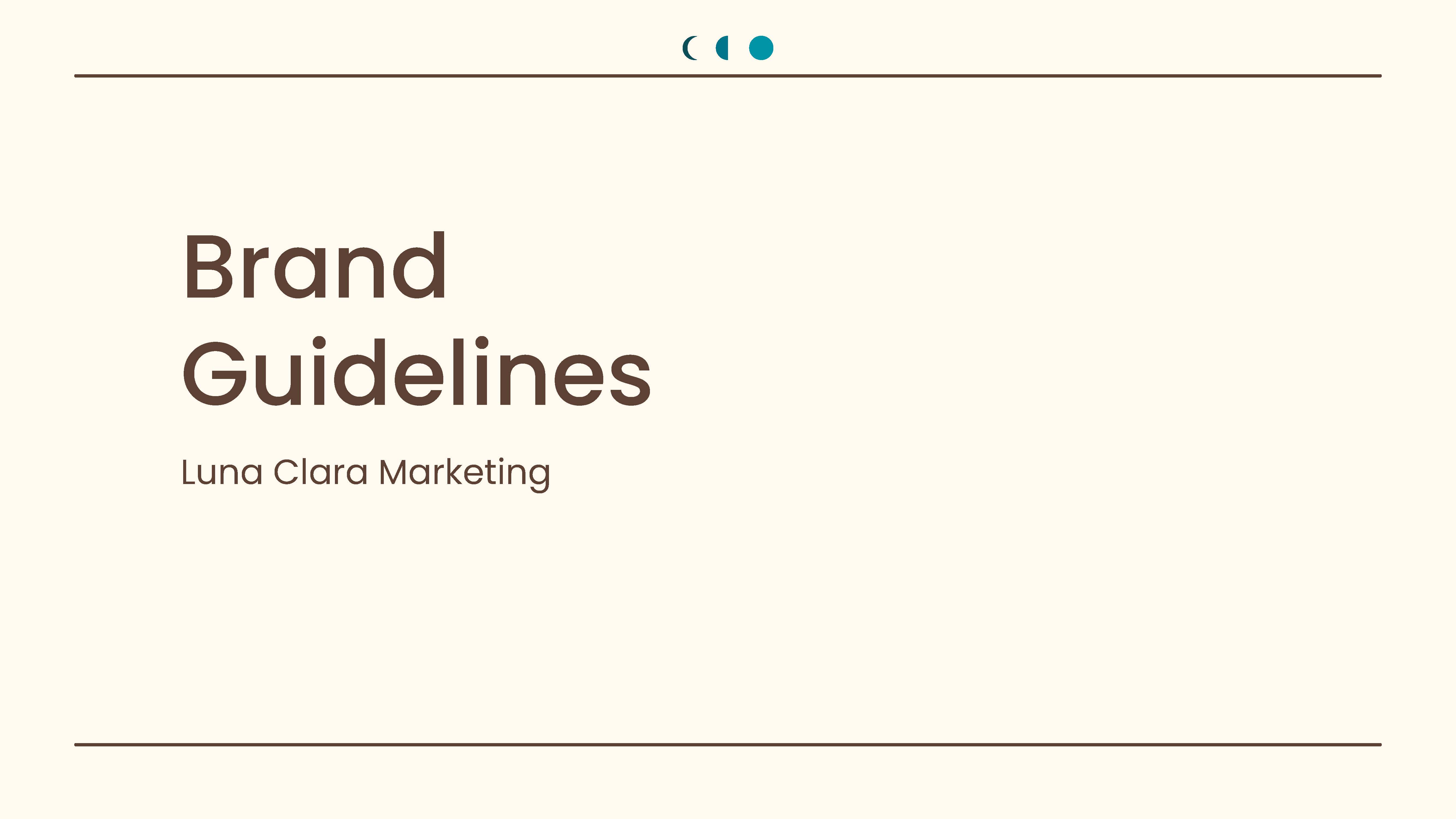
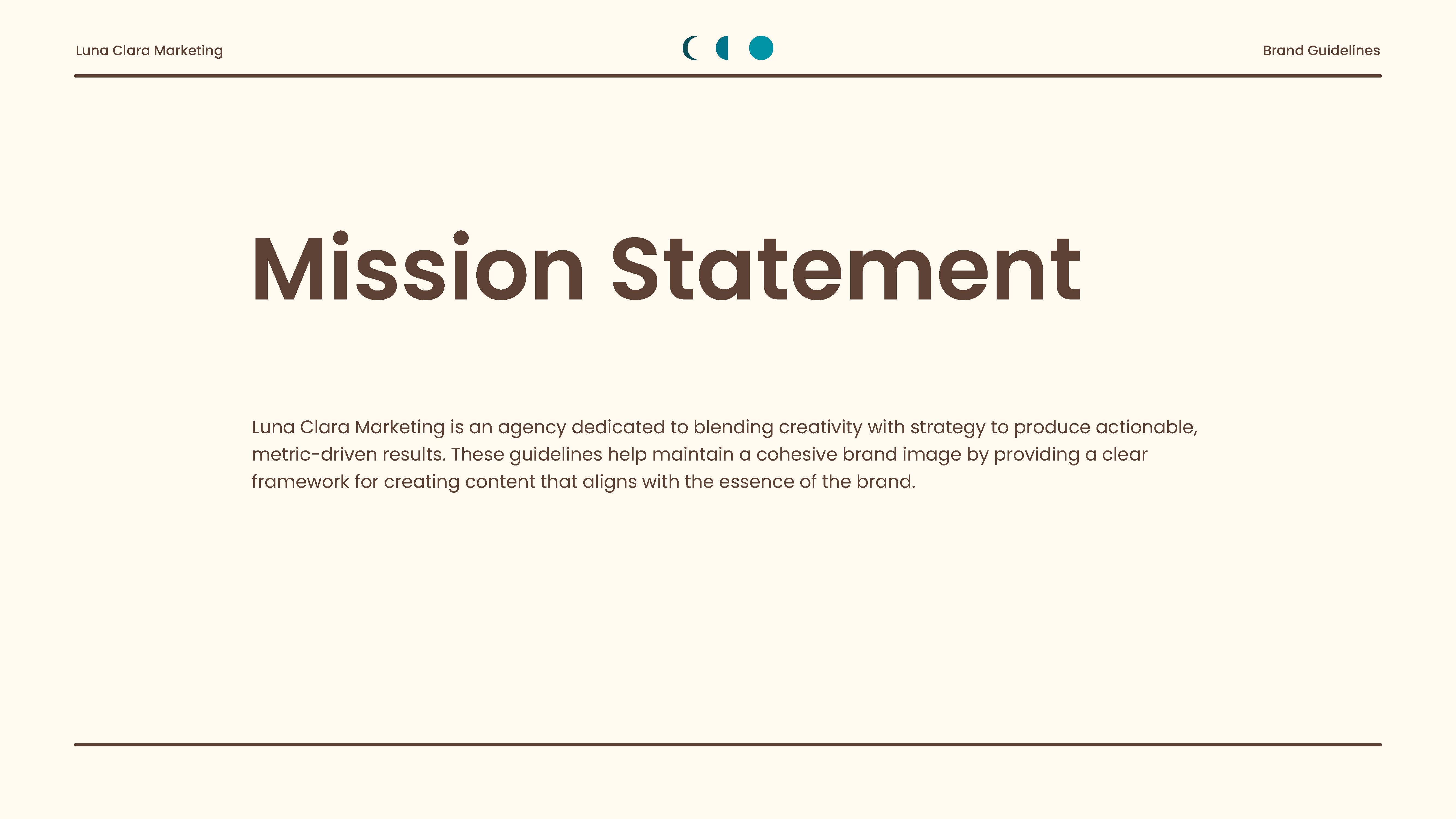
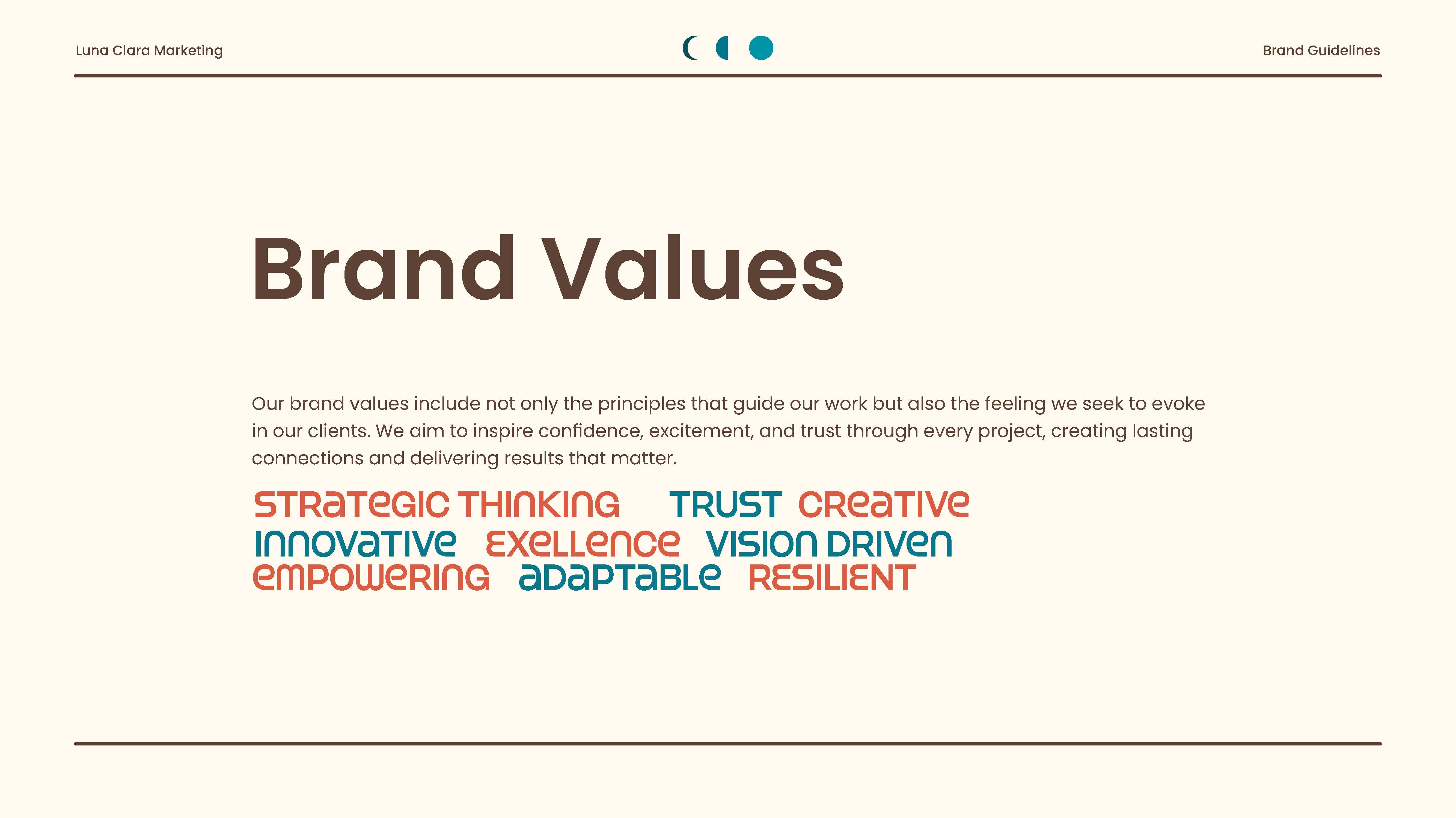
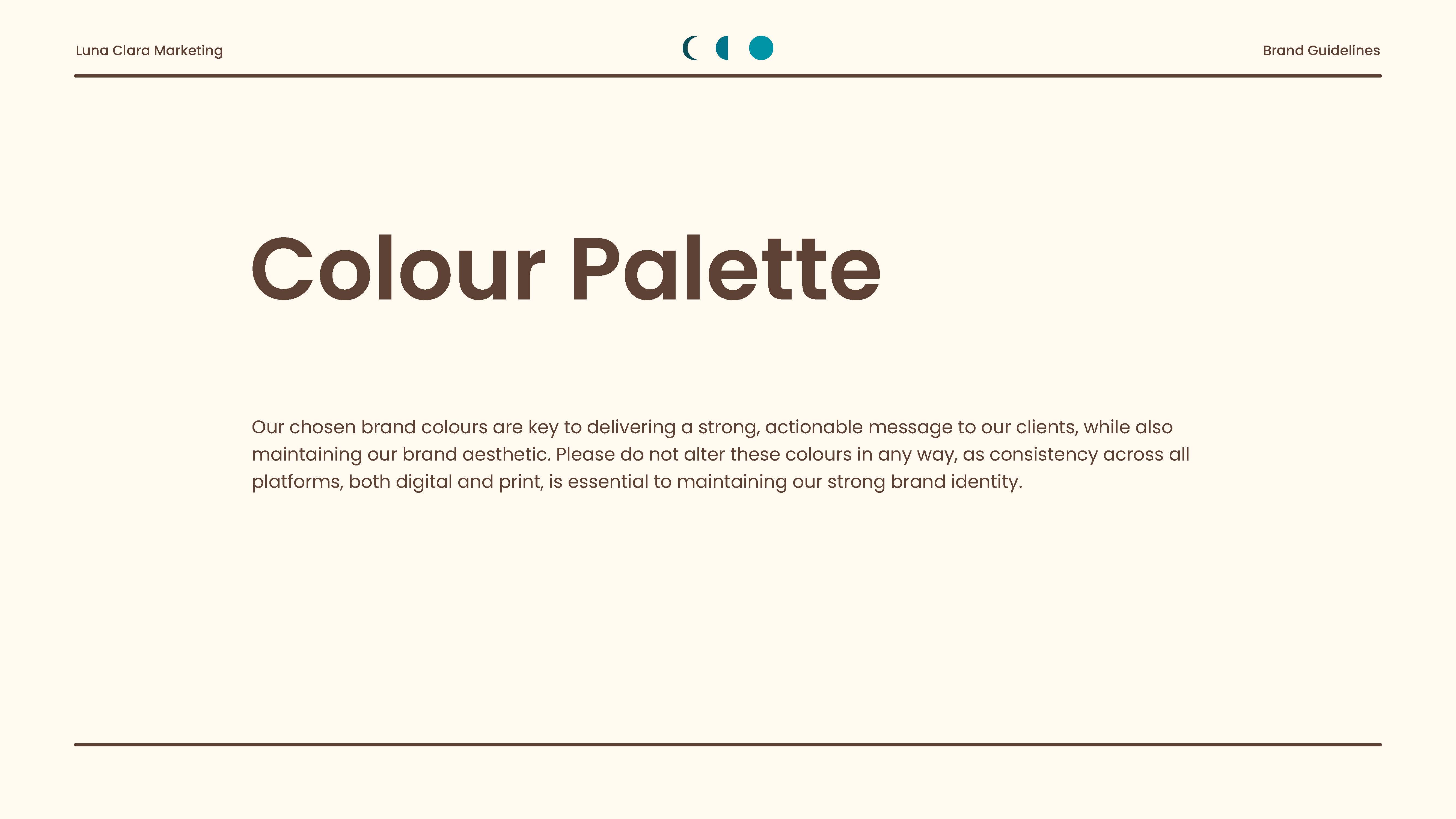
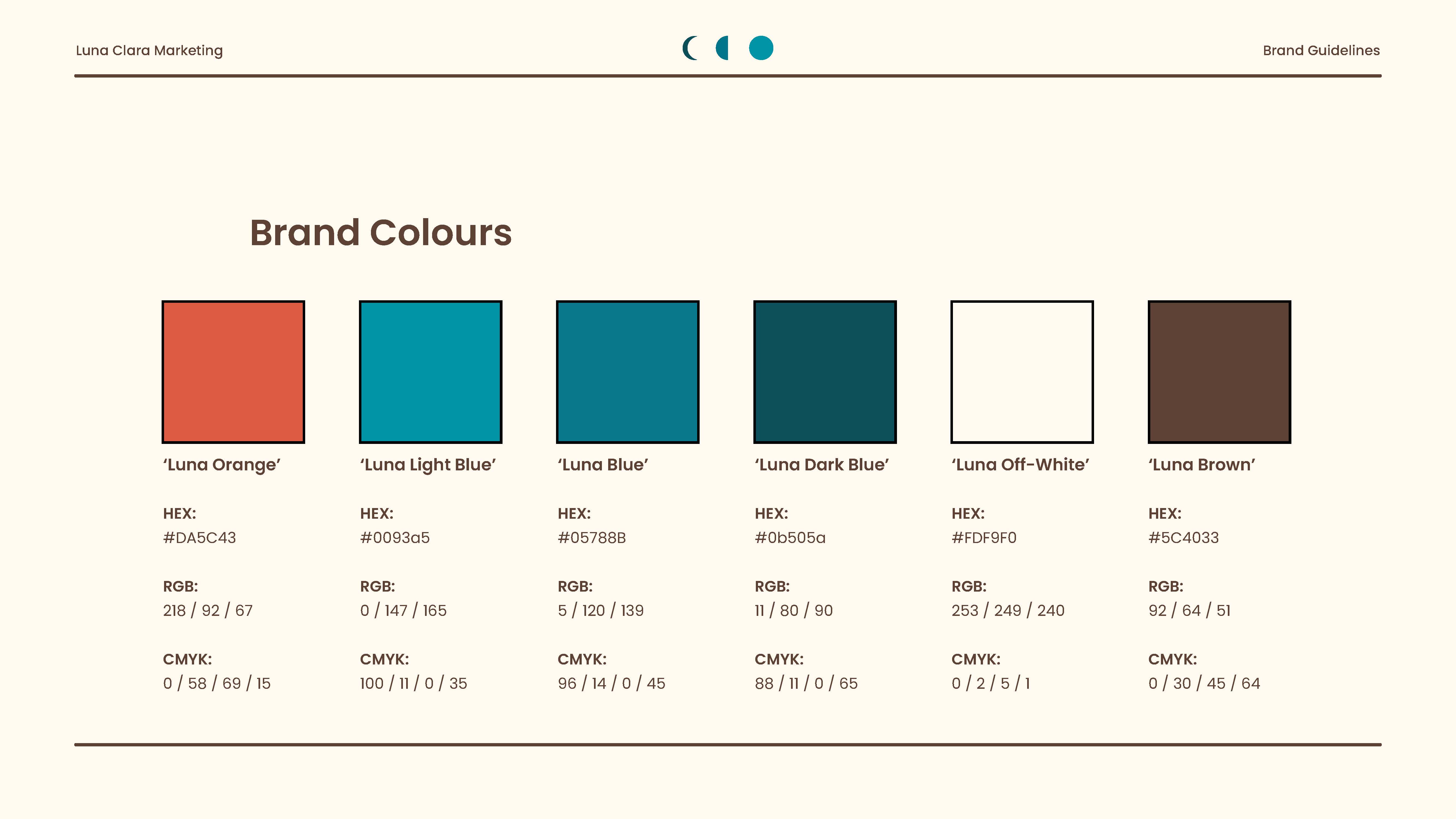
Luna Clara Marketing is a project where I led the complete brand design for a digital marketing agency. The goal of this brand identity was to blend creativity with strategy, delivering actionable, metric-driven results for clients. The brand’s message reflects the company’s core values, including a commitment to honesty, strategic thinking, and a strong work ethic.
Building this brand involved designing the logo and overall branding, conducting user research and competitor analysis, creating website wireframes, and developing a fully functional website. I also created marketing materials and a comprehensive brand guideline. This project represents months of dedicated work, including regular meetings with the agency owner to ensure the company’s vision was accurately brought to life.
Logo
Early Iterations
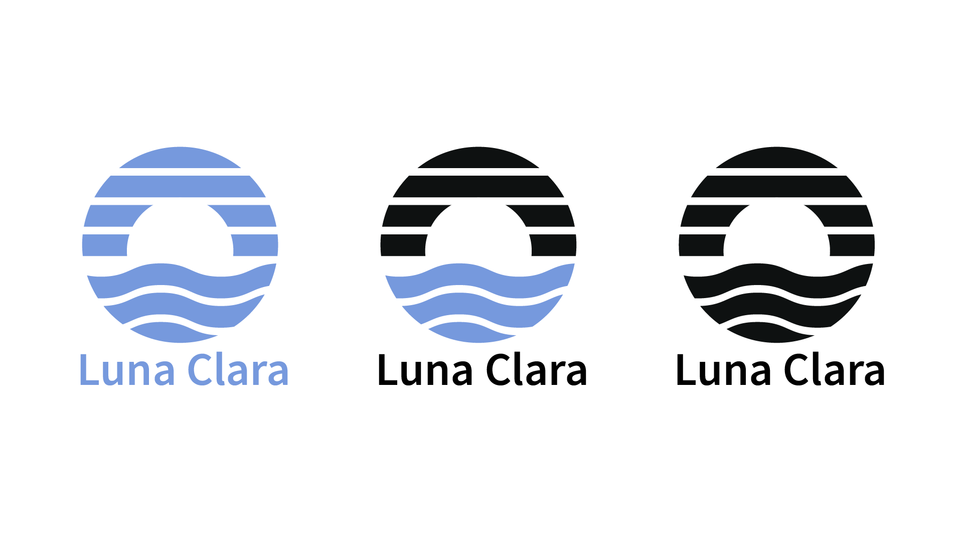
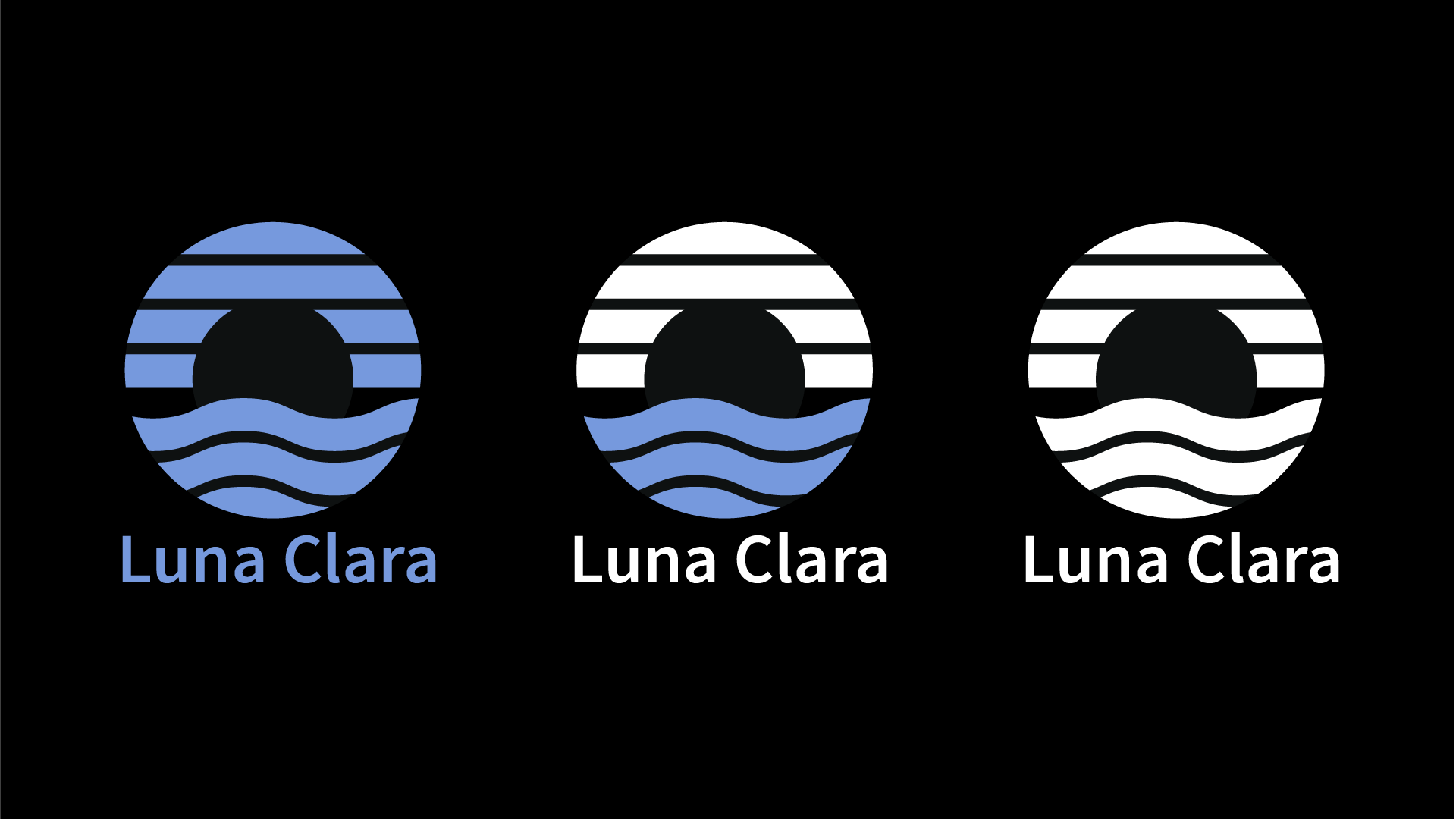
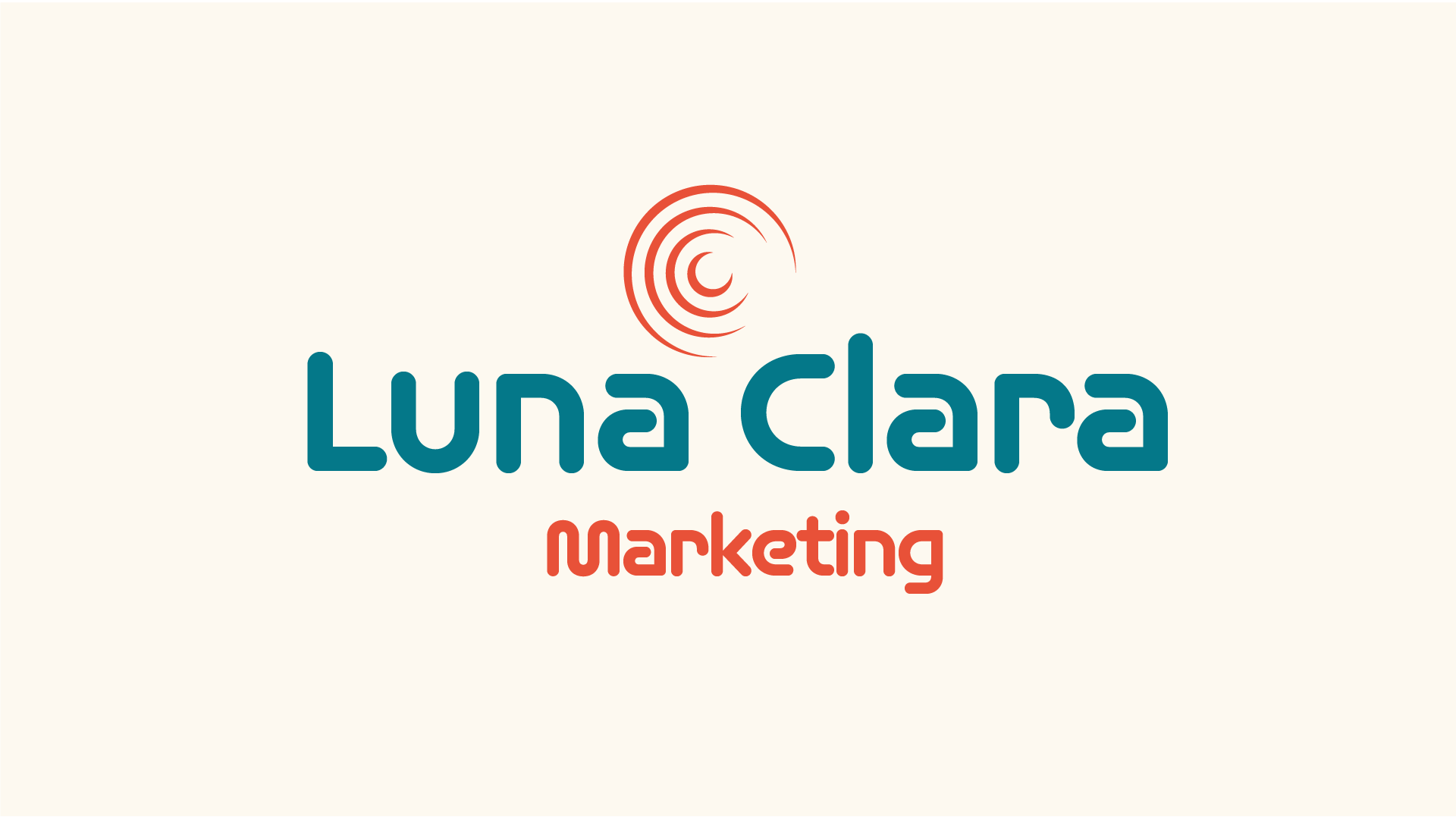
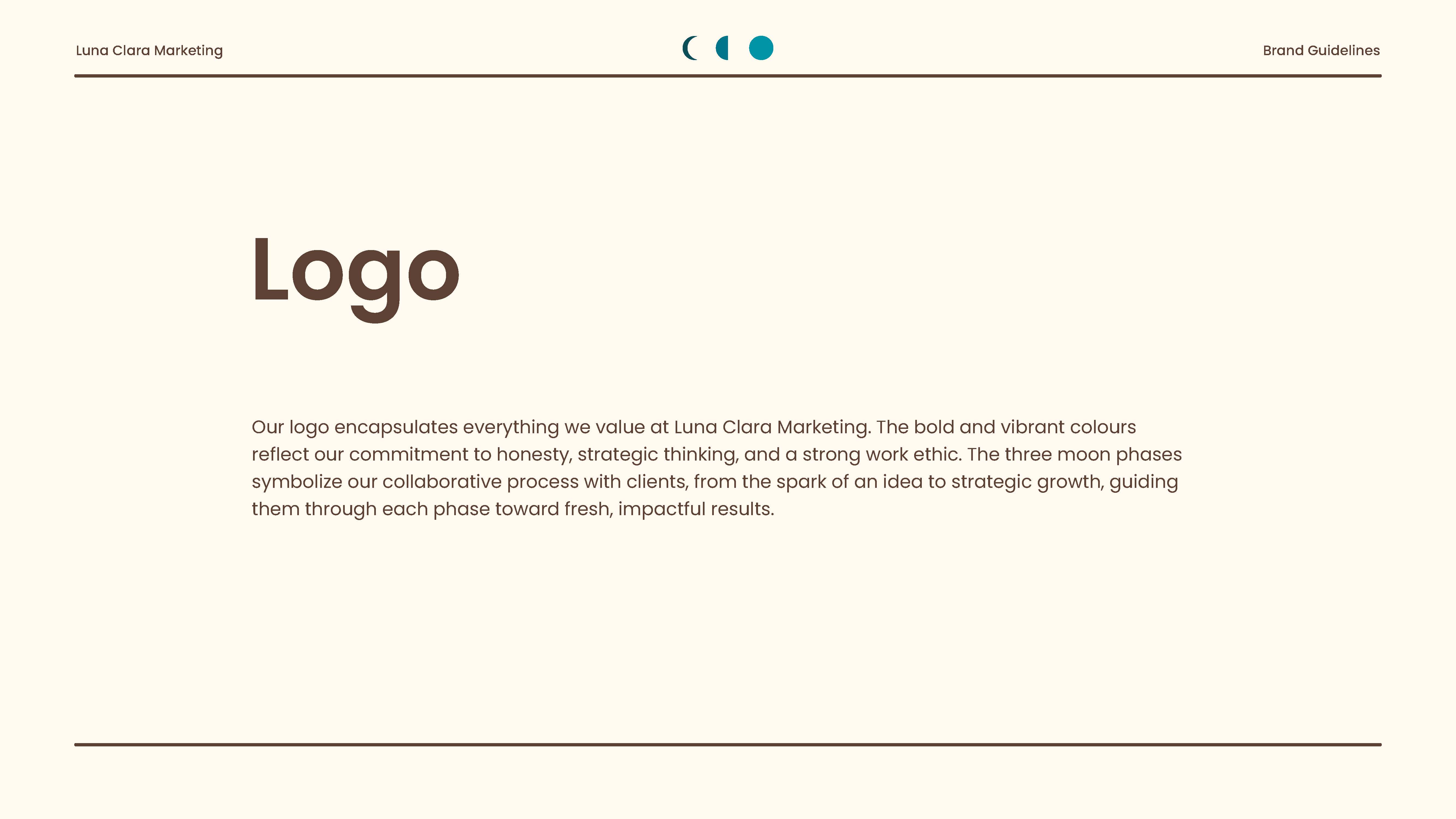
The initial logo concepts were designed to reflect a sense of completeness and balance to represent the company. The moon at the center represents a guiding light for clients, symbolizing support and direction. The flowing waves convey the fluid nature of the business, creating a look that feels both dynamic and gentle. The smooth upper lines suggest consistency and clarity, while the bottom lines symbolize creativity and problem-solving.
Initial Round of Feedback From Client
After the initial concepts were sent to the client, they noted that the design felt more like a sunset than a shining moon. They also mentioned that they wanted the name "Luna Clara" to be the most recognizable part of the logo, with more emphasis on typography rather than iconography. Additionally, they requested a warmer color palette and a larger, bolder font, and an off-white background.
Second Iterations
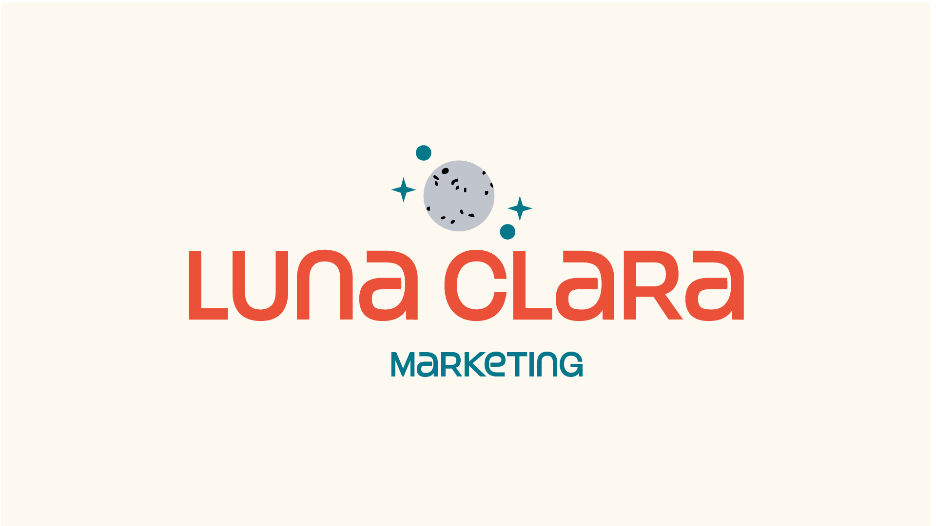
Second Round of Feedback From Client
After the second round of iterations was sent to the client, we began moving closer to their vision. They appreciated the inclusion of more "moon" elements in the design. While they weren’t fond of the animated concept or the abstract circular line idea, they did like the dot-based design. With this feedback, I was able to create new variations that aligned more closely with the client’s ideal vision.
Final Designs
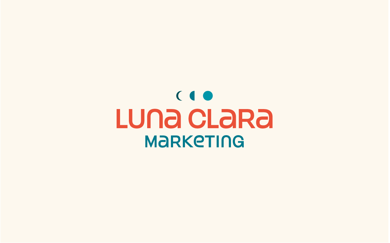
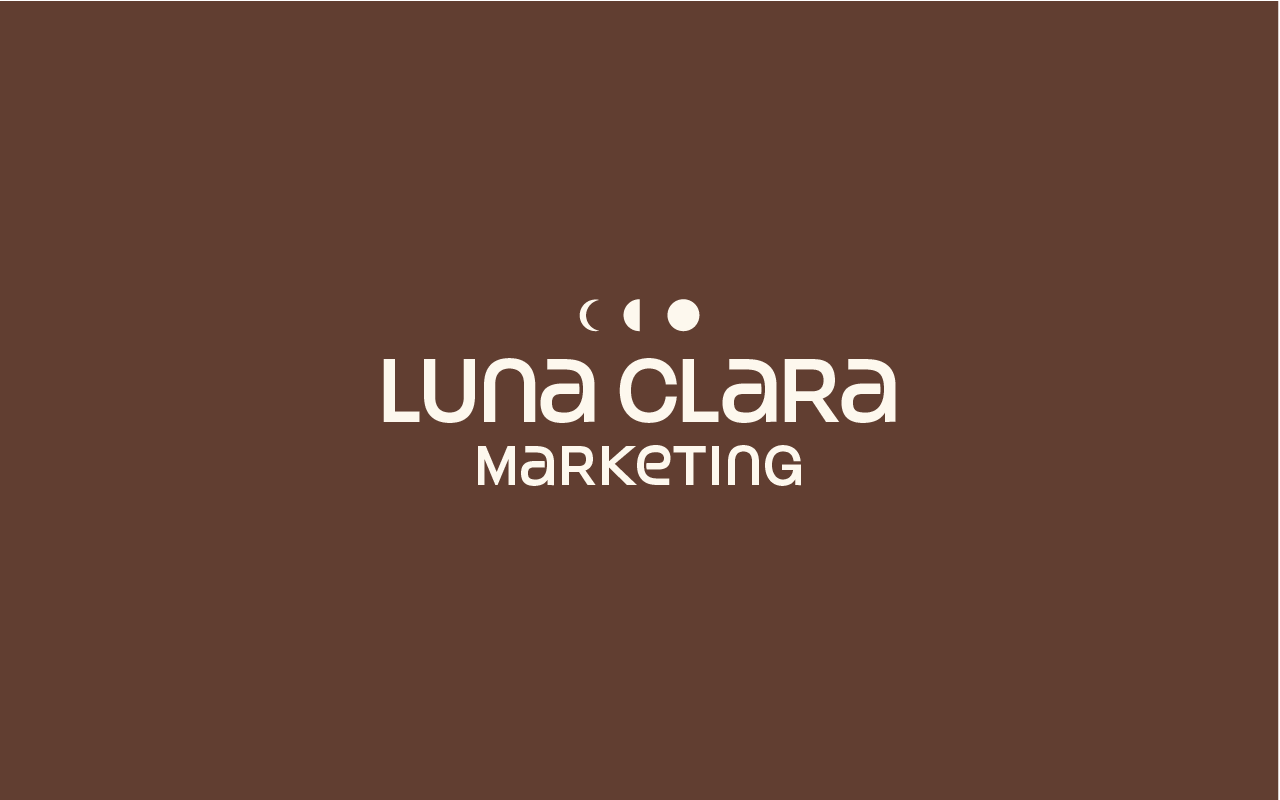
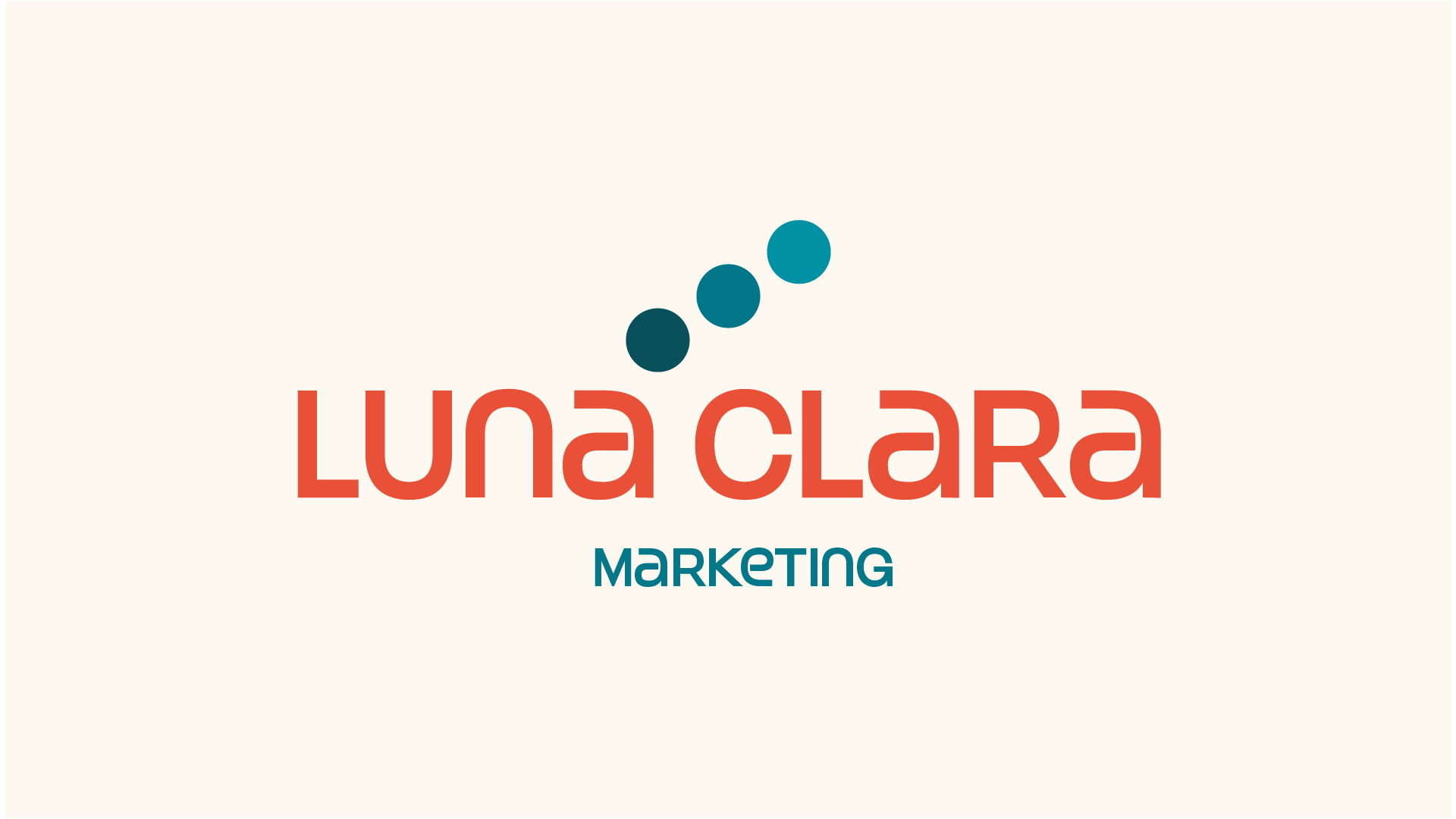
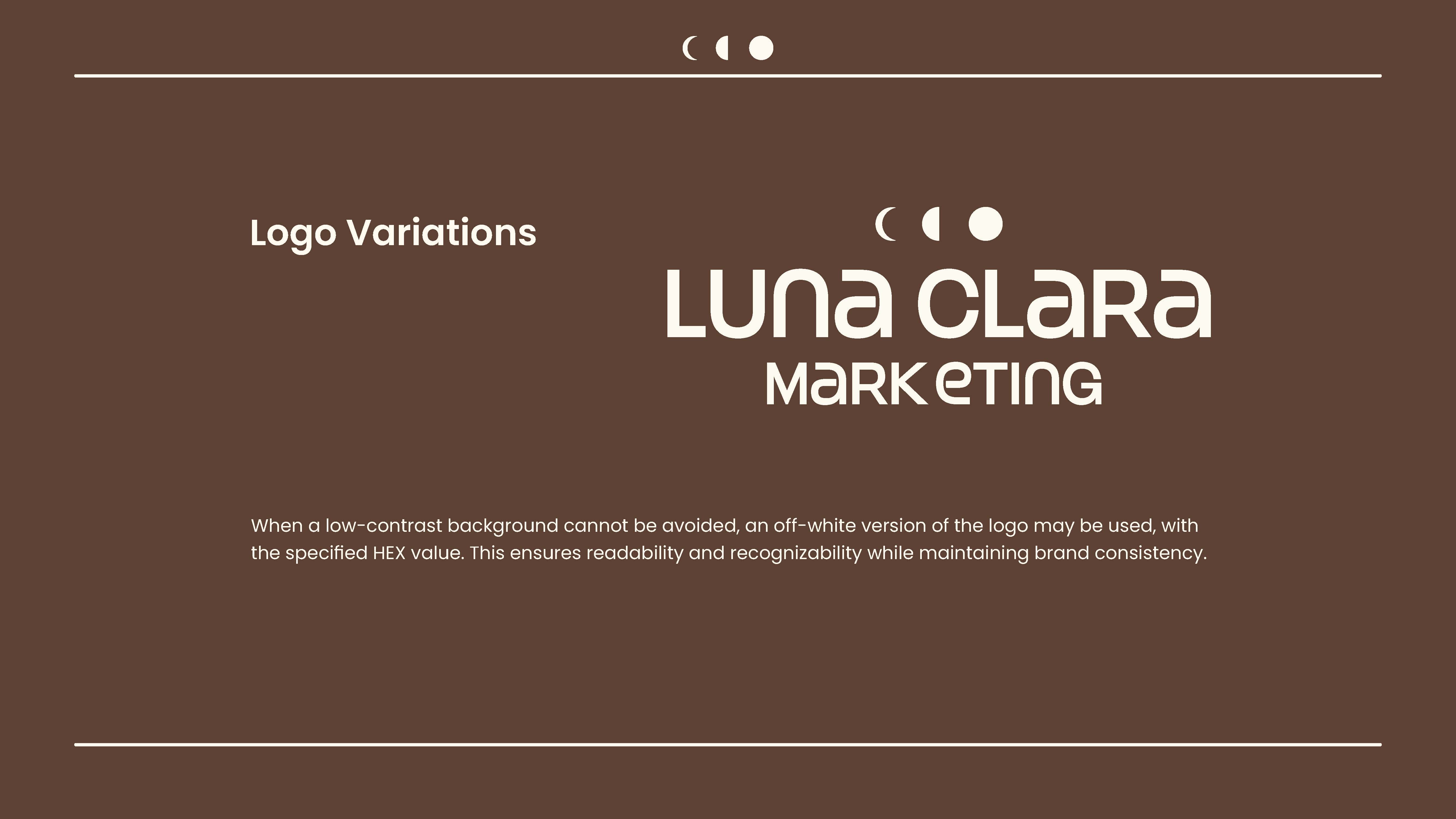
After the final designs were delivered, the client was happy with the result. The final version incorporated abstract moon elements to stay aligned with the brand vision, along with a clean, readable typeface to enhance overall legibility.
User Research
Creating user personas for the intended audience helped me design with purpose and clarity, while also giving the client valuable insights for marketing and running the business more effectively.
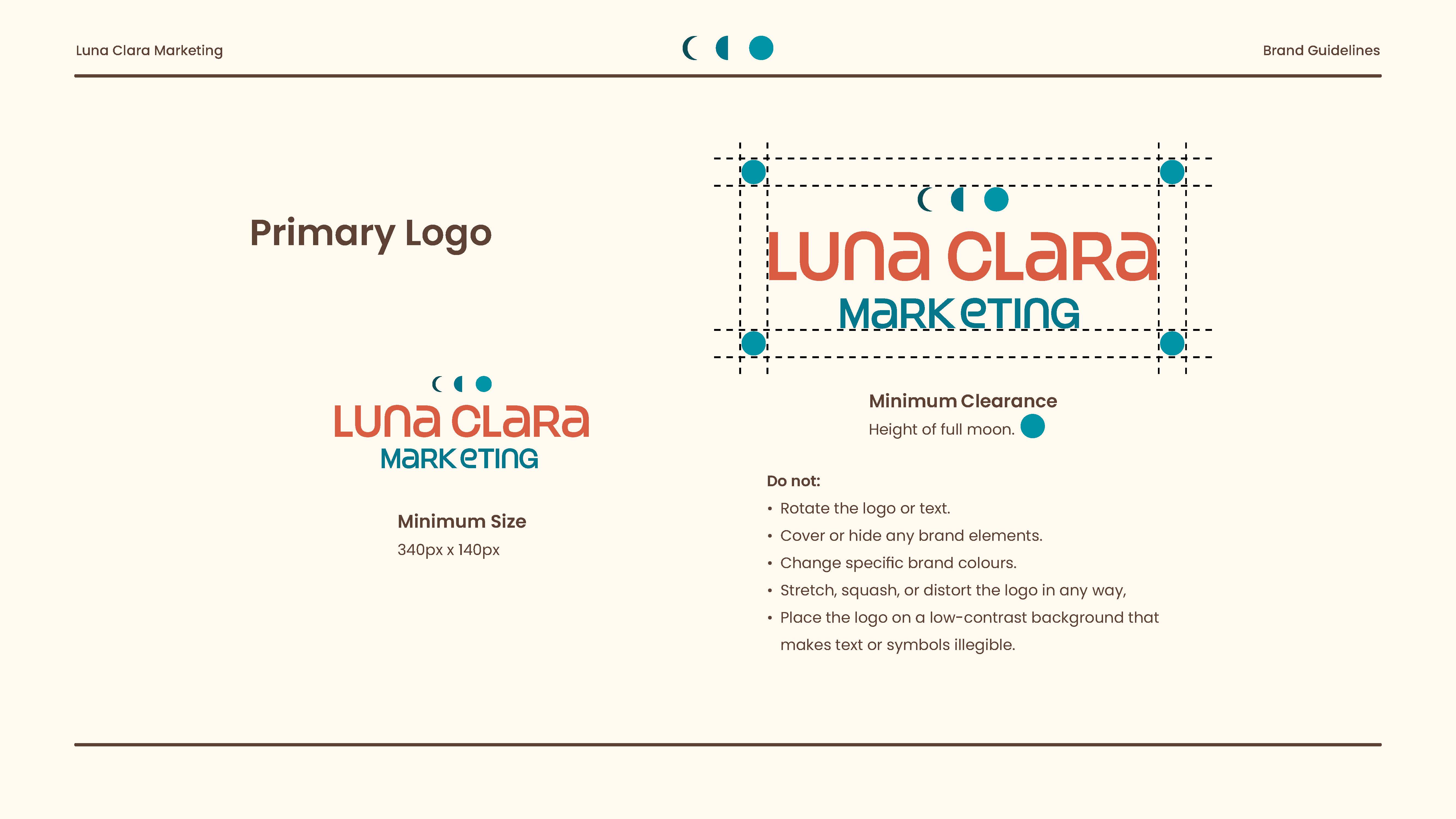
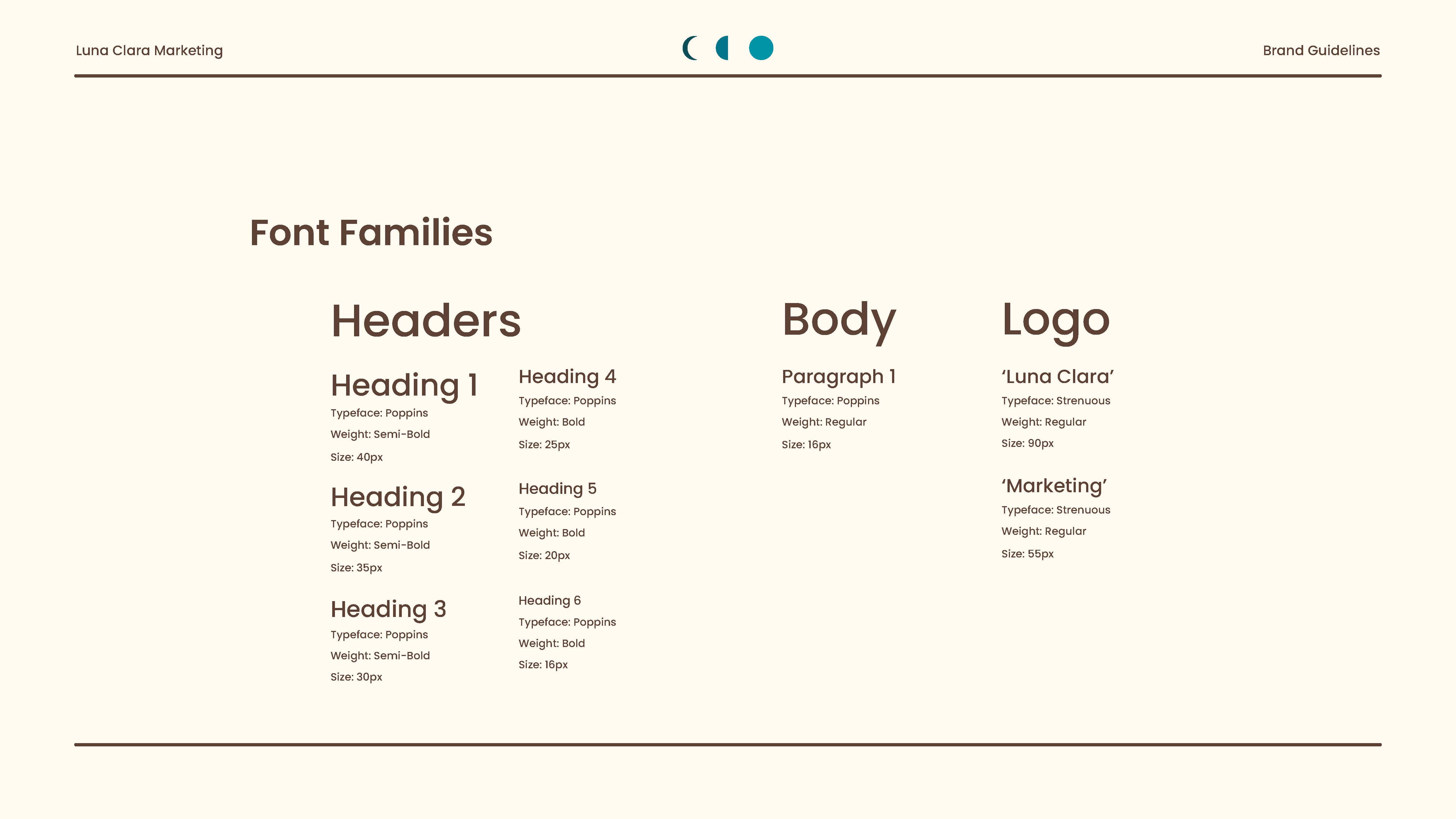
Brand Guidelines
This brand guidelines document will help the client maintain consistency across all design elements of her business and serve as a useful reference for any future designers she may work with.
Building this brand—from the initial kickoff meeting and idea session to a complete brand design—was a significant learning experience for me. It was a journey filled with creativity, exploration, and growth. This project gave me a clear understanding of how client–designer relationships should work, and it’s an experience that will serve me well as I enter the industry. It also gave me valuable insights into the full design process, allowing me to apply the strong concepts I learned in school to real-world results and deliverables.

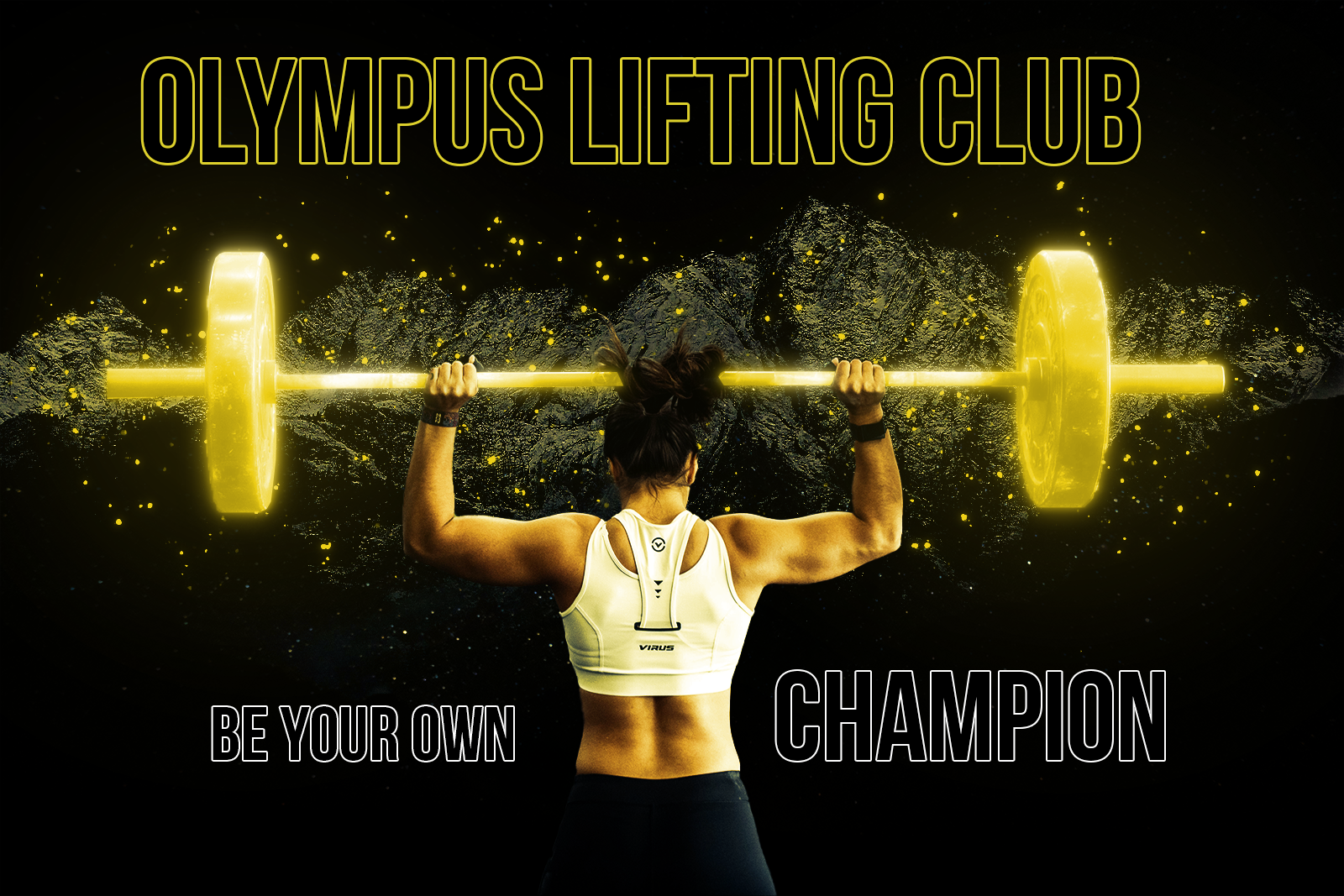
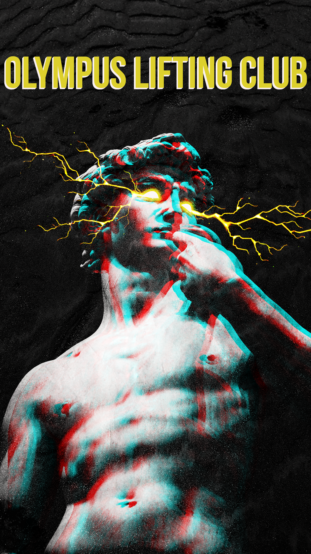
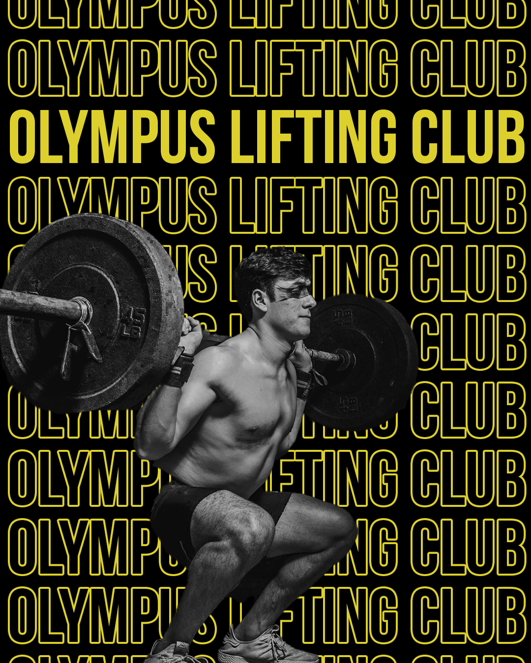
Olympus Lifting Club is a fictional athletic brand I envisioned to inspire and empower clients to unlock their full potential. Rooted in the spirit of resilience and excellence, it embodies the pursuit of greatness, encouraging individuals to rise above challenges and achieve their peak performance.
Building this brand from the ground up involved crafting the brand identity, designing the logo, developing brand guidelines, creating marketing materials, and much more.

I collaborated with a small team of classmates to design a website for an premium shoe brand. The website's concept focuses on a clean, modern aesthetic, leveraging whitespace and subtle color schemes to engage and attract customers.
Website Features:
- Description pages
- Cart functionality
- Form validation
- Responsive Design
- API retrieval
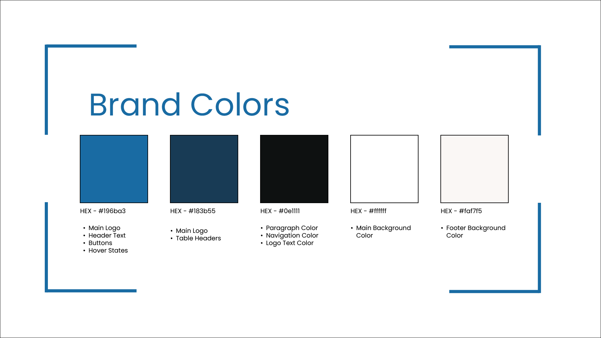
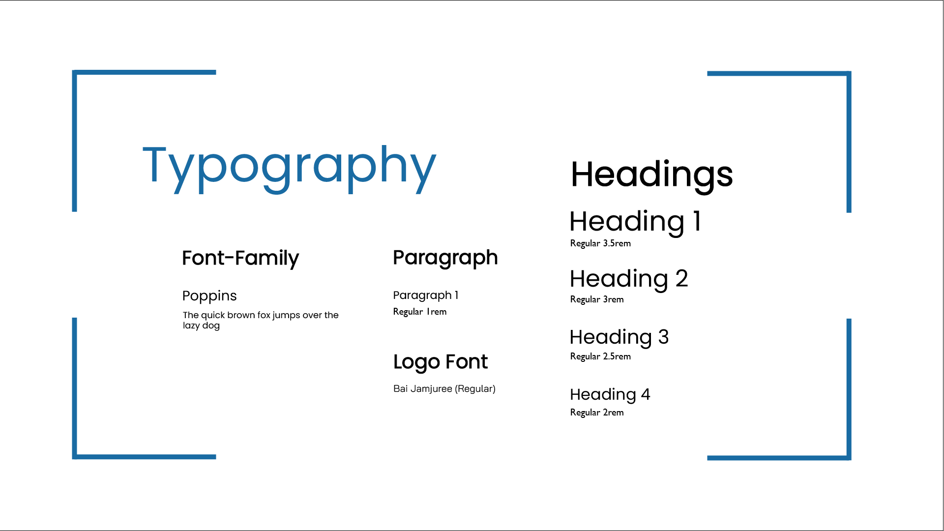
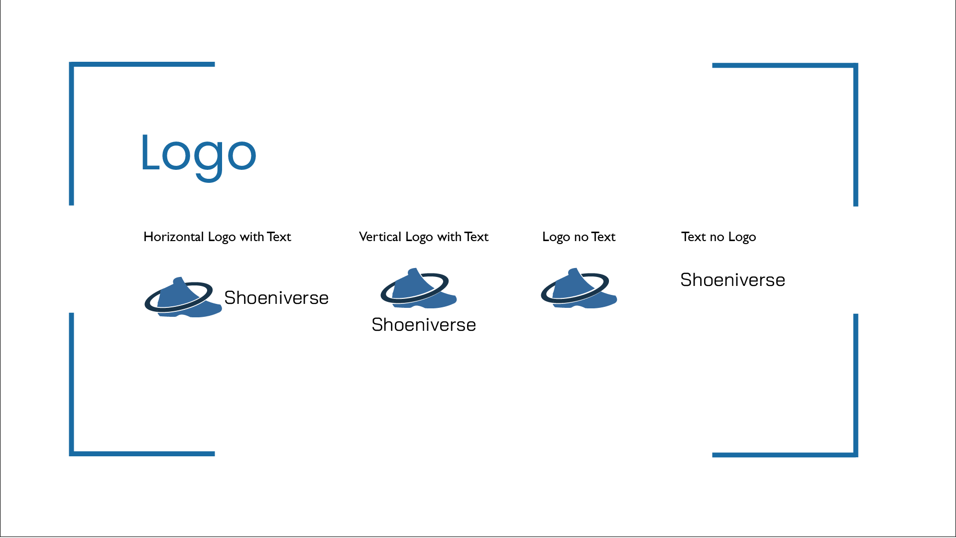
On this project, I utilized my development skills to write semantic and accessible code, ensuring the website adhered to best practices for usability and performance. Additionally, I applied my design expertise to create a comprehensive company style guide. This guide helped maintain consistency in key elements such as typography, colors, and sizing across the website, aligning with the team's clean and sleek aesthetic vision.

I worked with a small team of classmates to design a website for an indie game studio. The concept of the site highlights a fun, inspiring, and creative brand, using vibrant colors to evoke a welcoming, homey atmosphere reflective of the studio.
Website Features:
- Description pages
- Cart functionality
- Form validation
- Responsive Design
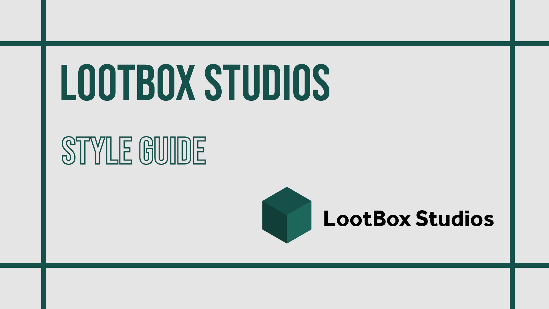
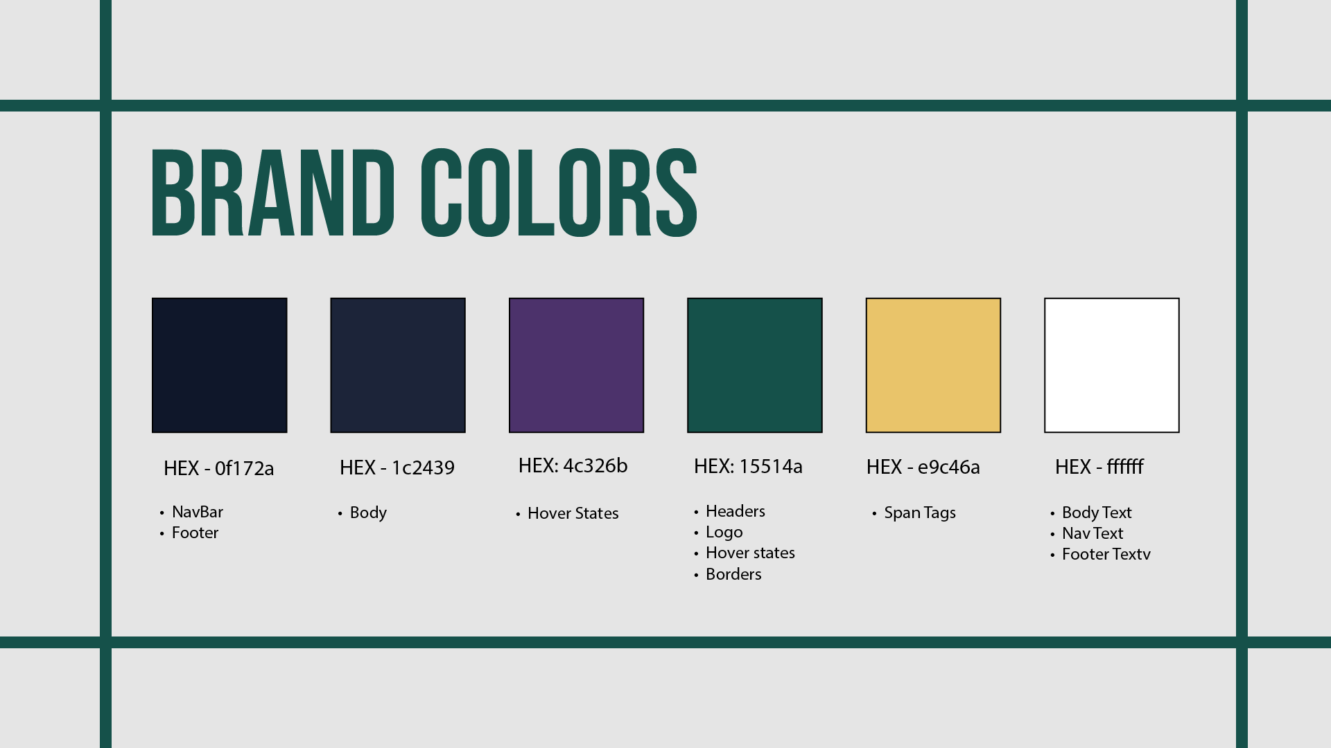
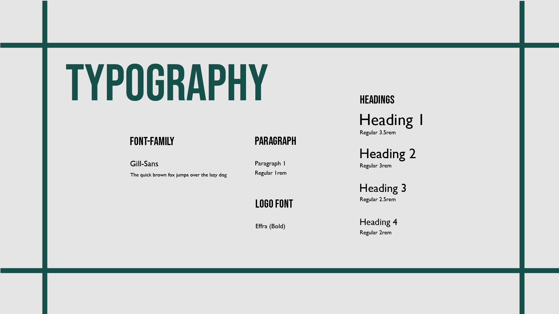
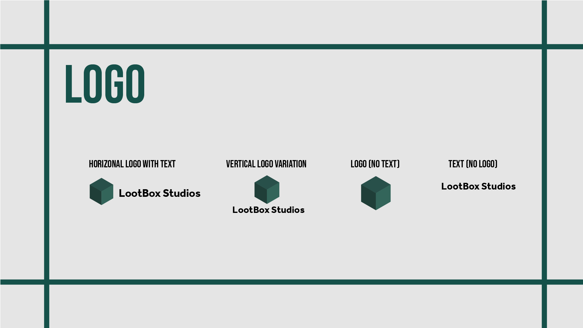
As the design lead for this project, I ensured that all styles and branding aligned seamlessly with the company’s product. Utilizing a range of design skills, I developed a cohesive and clean aesthetic for the website, aimed at attracting customers who resonate with Lootbox's brand identity. Additionally, I wrote accessible and well-structured code to enhance the website's functionality, providing users with a seamless and intuitive experience.
I also developed a style guide for our team to ensure consistency in design elements, keeping everyone aligned and maintaining a cohesive visual direction throughout the project.
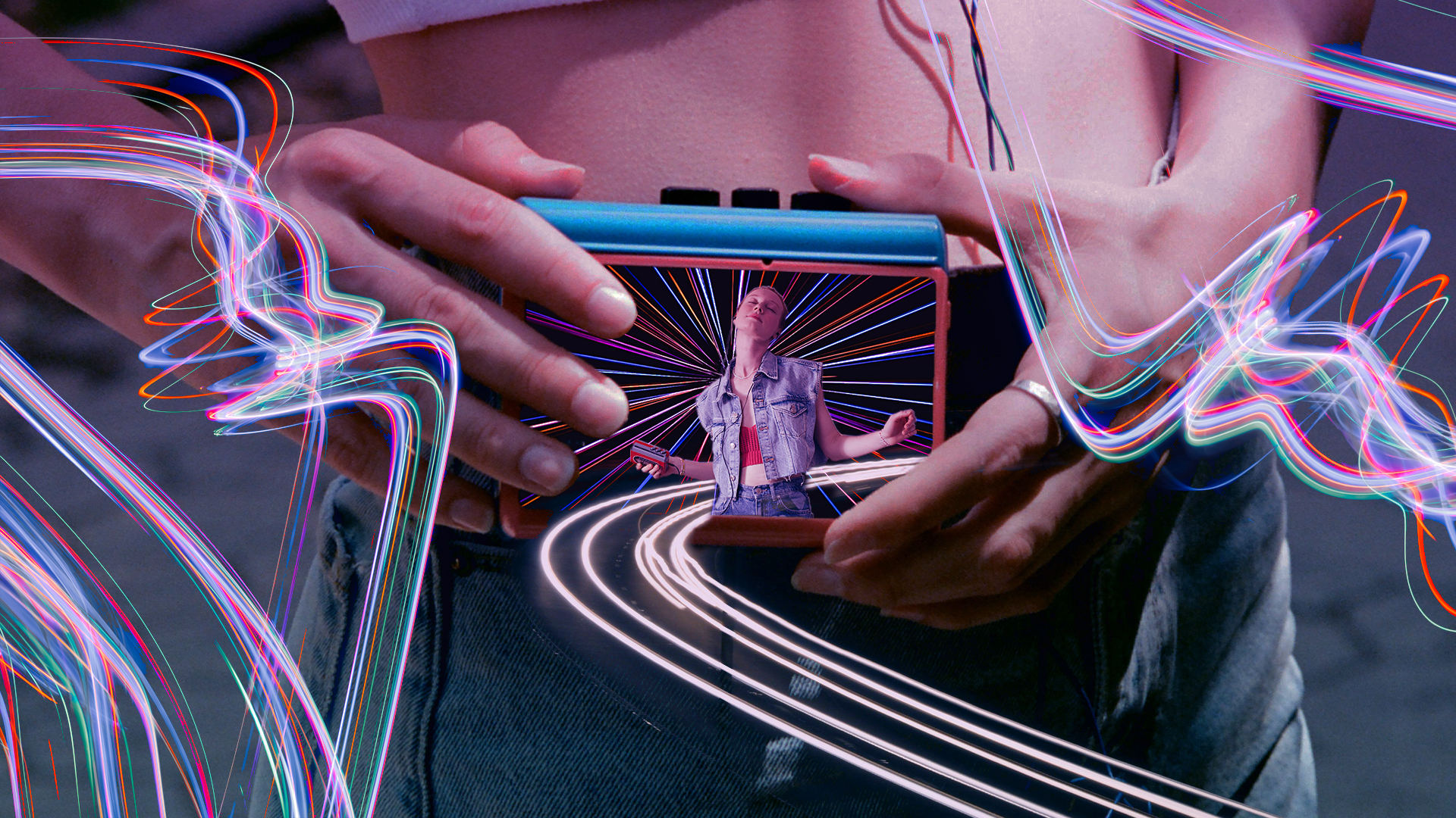
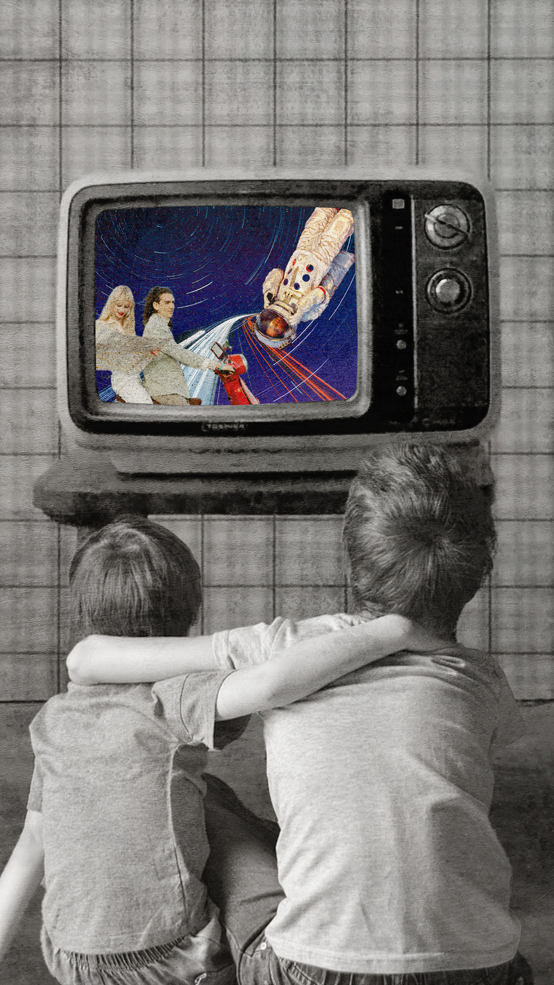
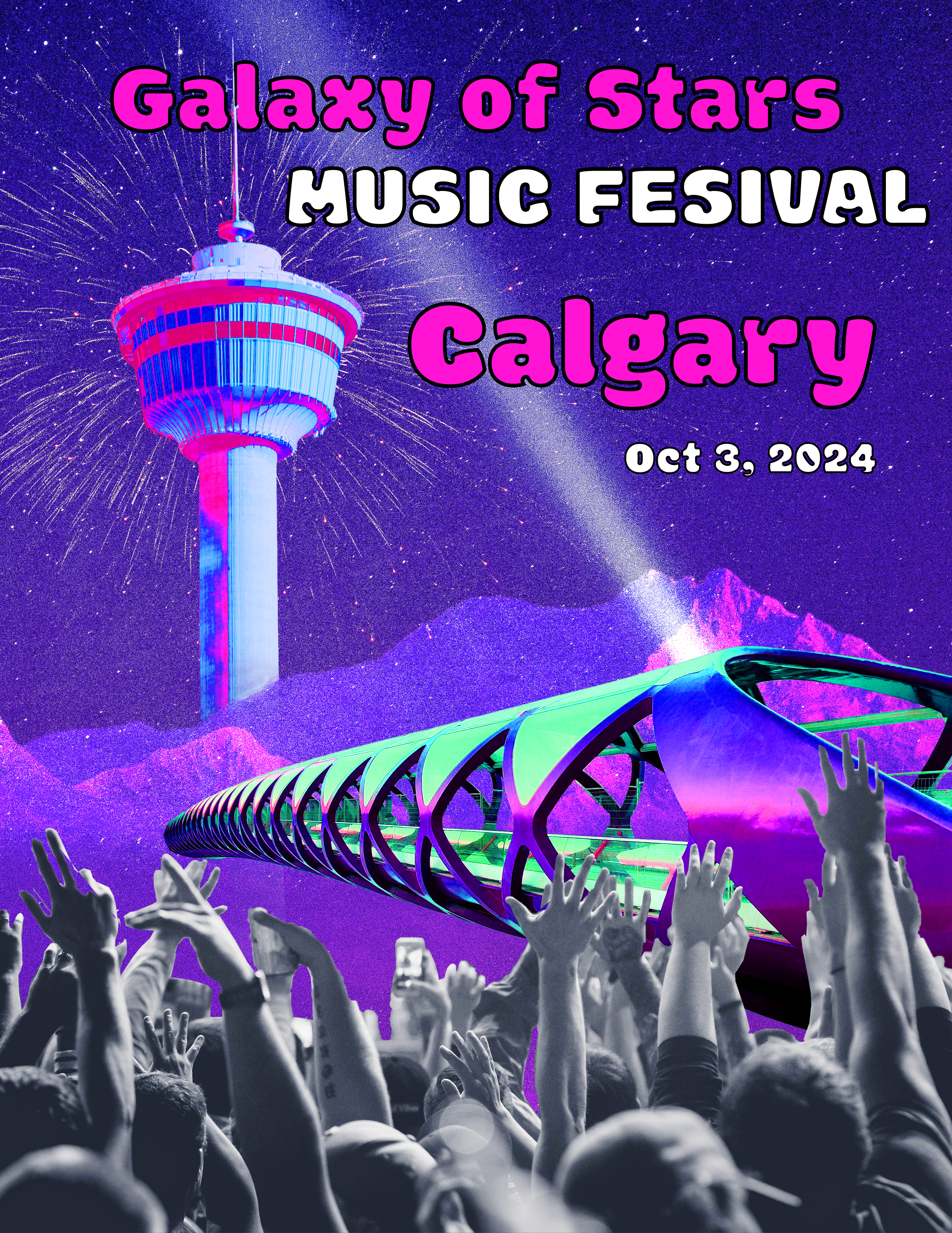
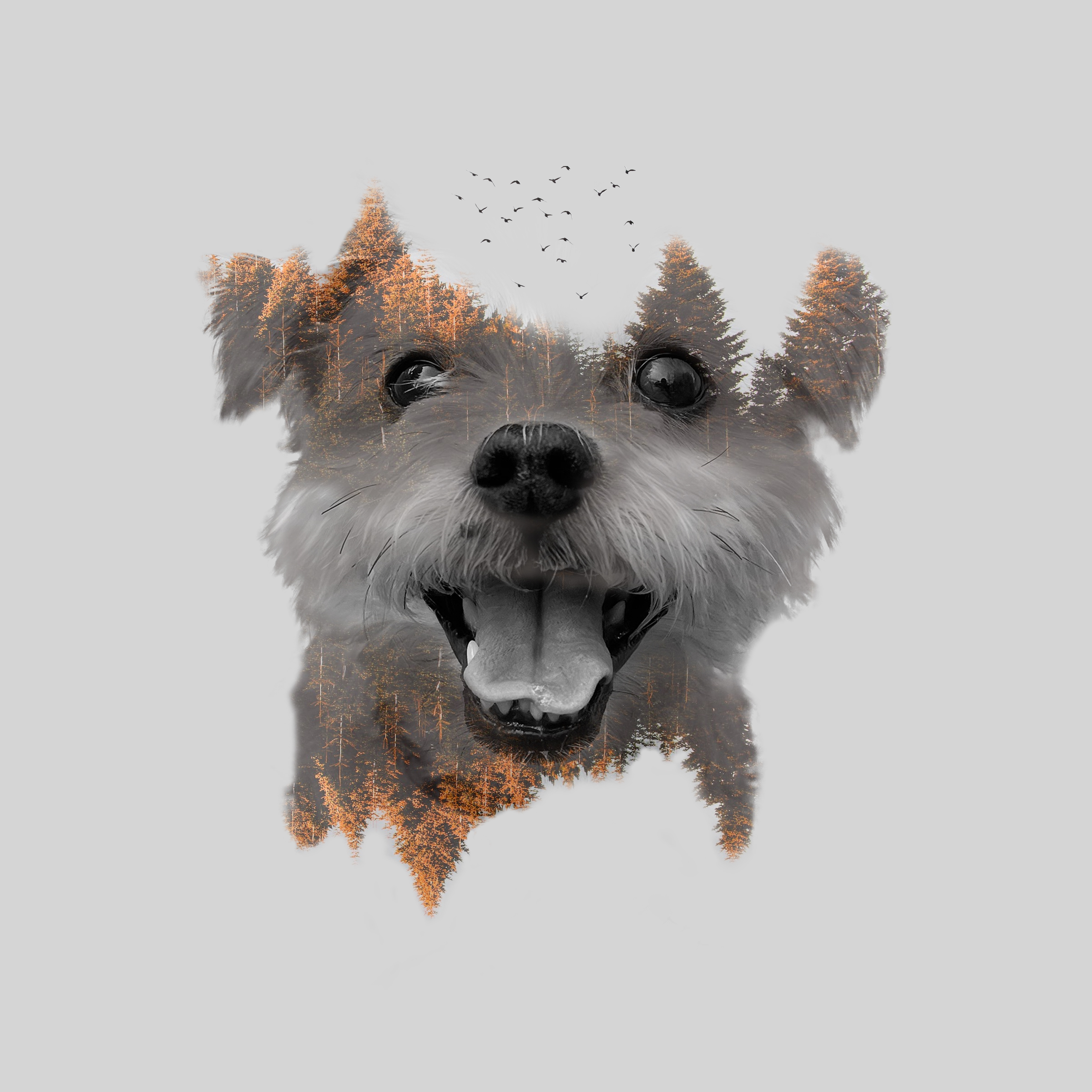
graphic design pieces